Stylesheets
The theme’s assets/css/main.css file is built from several SCSS partials located in _sass/ and is structured as follows:
minimal-mistakes
├── _sass
|  └── minimal-mistakes
|     ├── vendor               # vendor SCSS partials
|     |   ├── breakpoint       # media query mixins
|     |   ├── font-awesome     # Font Awesome icons
|     |   ├── magnific-popup   # Magnific Popup lightbox
|     |   └── susy             # Susy grid system
|     ├── _animations.scss     # animations
|     ├── _archive.scss        # archives (list, grid, feature views)
|     ├── _base.scss           # base HTML elements
|     ├── _buttons.scss        # buttons
|     ├── _footer.scss         # footer
|     ├── _masthead.scss       # masthead
|     ├── _mixins.scss         # mixins (em function, clearfix)
|     ├── _navigation.scss     # nav links (breadcrumb, priority+, toc, pagination, etc.)
|     ├── _notices.scss        # notices
|     ├── _page.scss           # pages
|     ├── _print.scss          # print styles
|     ├── _reset.scss          # reset
|     ├── _sidebar.scss        # sidebar
|     ├── _syntax.scss         # syntax highlighting
|     ├── _tables.scss         # tables
|     ├── _utilities.scss      # utility classes (text/image alignment)
|     └── _variables.scss      # theme defaults (fonts, colors, etc.)
├── assets
|  ├── css
|  |  └── main.scss            # main stylesheet, loads SCSS partials in _sass
Customizing
To override the default Sass (located in theme’s
_sass directory), do one of the following:
-
Copy directly from the Minimal Mistakes theme gem
- Go to your local Minimal Mistakes gem installation directory (run
bundle show minimal-mistakes-jekyllto get the path to it). - Copy the contents of
/assets/css/main.scssfrom there to<your_project>. - Customize what you want inside
<your_project>/assets/css/main.scss.
- Go to your local Minimal Mistakes gem installation directory (run
-
Copy from this repo.
- Copy the contents of assets/css/main.scss
to
<your_project>. - Customize what you want inside
<your_project/assets/css/main.scss.
- Copy the contents of assets/css/main.scss
to
Note: To make more extensive changes and customize the Sass partials bundled
in the gem. You will need to copy the complete contents of the _sass directory
to <your_project> due to the way Jekyll currently reads those files.
To make basic tweaks to theme’s style Sass variables can be overridden by adding
to <your_project>/assets/css/main.scss. For instance, to change the
link color used throughout the theme add:
$link-color: red;
Before any @import lines.
Paragraph Indention
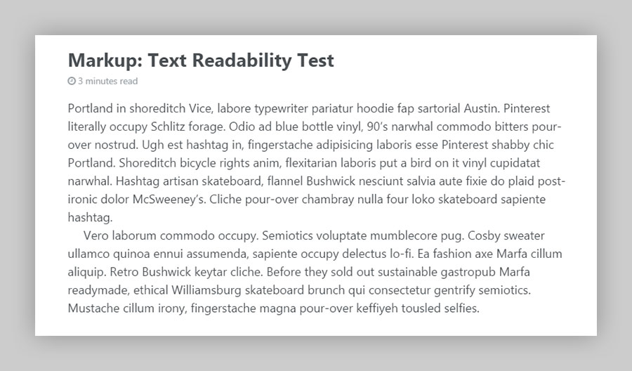
To mimic the look of type set in a printed book or manuscript you may want to enable paragraph indention. When $paragraph-indent is set to true indents are added to each sibling and the margin below each paragraph is removed.

The size of the indent can also be customized by changing the value of $indent-var.
Font Stacks
By default the theme uses system fonts for all of the font stacks (serif, sans-serif, and monospace). This is done in part to provide a clean base for you to build off of and to improve performance since we aren’t loading any custom webfonts1 by default.
/* system typefaces */
$serif      : Georgia, Times, serif;
$sans-serif : -apple-system, BlinkMacSystemFont, "Roboto", "Segoe UI", "Helvetica Neue", "Lucida Grande", Arial, sans-serif;
$monospace  : Monaco, Consolas, "Lucida Console", monospace;
Sans-serif fonts have been used for most of the type, with serifs reserved for captions. If you wish to change this you’ll need to poke around the various SCSS partials and modify font-family declarations.
ProTip: To use webfonts from services like Adobe TypeKit or Google Fonts simply update the font stacks and then add their scripts to _includes/head/custom.html.
Typography from Older Versions
Not a fan of the refreshed typography of the theme and want to revert back an older version? Easy enough.
1. Add this Google Fonts script to _includes/head/custom.html:
<link href="https://fonts.googleapis.com/css?family=PT+Sans+Narrow:400,700|PT+Serif:400,700,400italic" rel="stylesheet" type="text/css">
2. Update the following SCSS variables:
$serif              : "PT Serif", Georgia, Times, serif;
$sans-serif-narrow  : "PT Sans Narrow", -apple-system, BlinkMacSystemFont, "Roboto", "Segoe UI", "Helvetica Neue", "Lucida Grande", Arial, sans-serif;

$global-font-family : $serif;
$header-font-family : $sans-serif-narrow;
Type Scale
Wherever possible type scale variables have been used instead of writing out fixed sizes. This makes updating much easier by changing values in one file.
Example:
.page__lead {
  font-family: $global-font-family;
  font-size: $type-size-4;
}
Type sizes are set in ems to proportional scale as the screen size changes. Large headlines that look great on desktop monitors will shrink ever so slightly as to not be too big on mobile devices. To adjust this hierarchy simply edit the default values:
/* type scale */
$type-size-1 : 2.441em;  // ~39.056px
$type-size-2 : 1.953em;  // ~31.248px
$type-size-3 : 1.563em;  // ~25.008px
$type-size-4 : 1.25em;   // ~20px
$type-size-5 : 1em;      // ~16px
$type-size-6 : 0.75em;   // ~12px
$type-size-7 : 0.6875em; // ~11px
$type-size-8 : 0.625em;  // ~10px
Colors
Change the mood of your site by altering a few color variables. $body-color, $background-color, $text-color, $link-color, and $masthead-link-color will have the most affect when changed.
Breakpoints and Grid Stuff
Probably won’t need to touch these, but they’re there if you need to. Width variables are used with the @include breakpoint() mixin to adapt the design of certain elements.
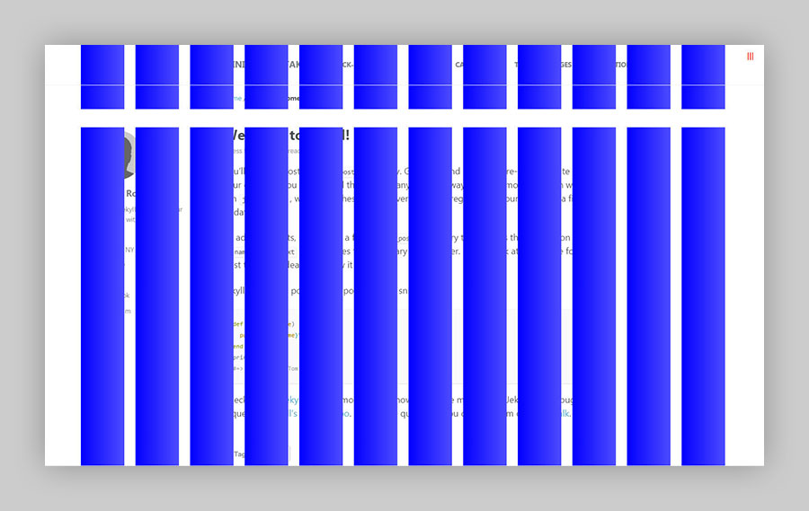
And $susy is used for setting the grid the theme uses. Uncommenting the lines under debug can be useful if you want to show the columns when adjusting the layout.

Disabling Animations
You can disable either the fade-in intro animation, element transition animations, or both by overriding the corresponding variables. For example if you wanted to disable all animations you could include the following lines:
$intro-transition  : none;
$global-transition : none;
-
Apart from Font Awesome icon webfonts. ↩